Mobile popups and interstitials, maybe it is time to optimize
Pop up windows and intertitials are used more and more to achieve a bunch of multiple goals in e-shops and websites, such us mailing list subscriptions, inbound lead generation and Facebook fan page expansion, but it seems that for mobile uses this kind of tactic should be dropped.
Google recently announced in its official blog that “To improve the mobile search experience, after January 10, 2017, pages where content is not easily accessible to a user on the transition from the mobile search results may not rank as highly.”. We knew that Google is quite serious about mobile and cares a lot about UX, thus Google wants to make sure that all content is easily accessible on mobile devices and, the use of interstitials usually make content tougher to access.
What does this mean?
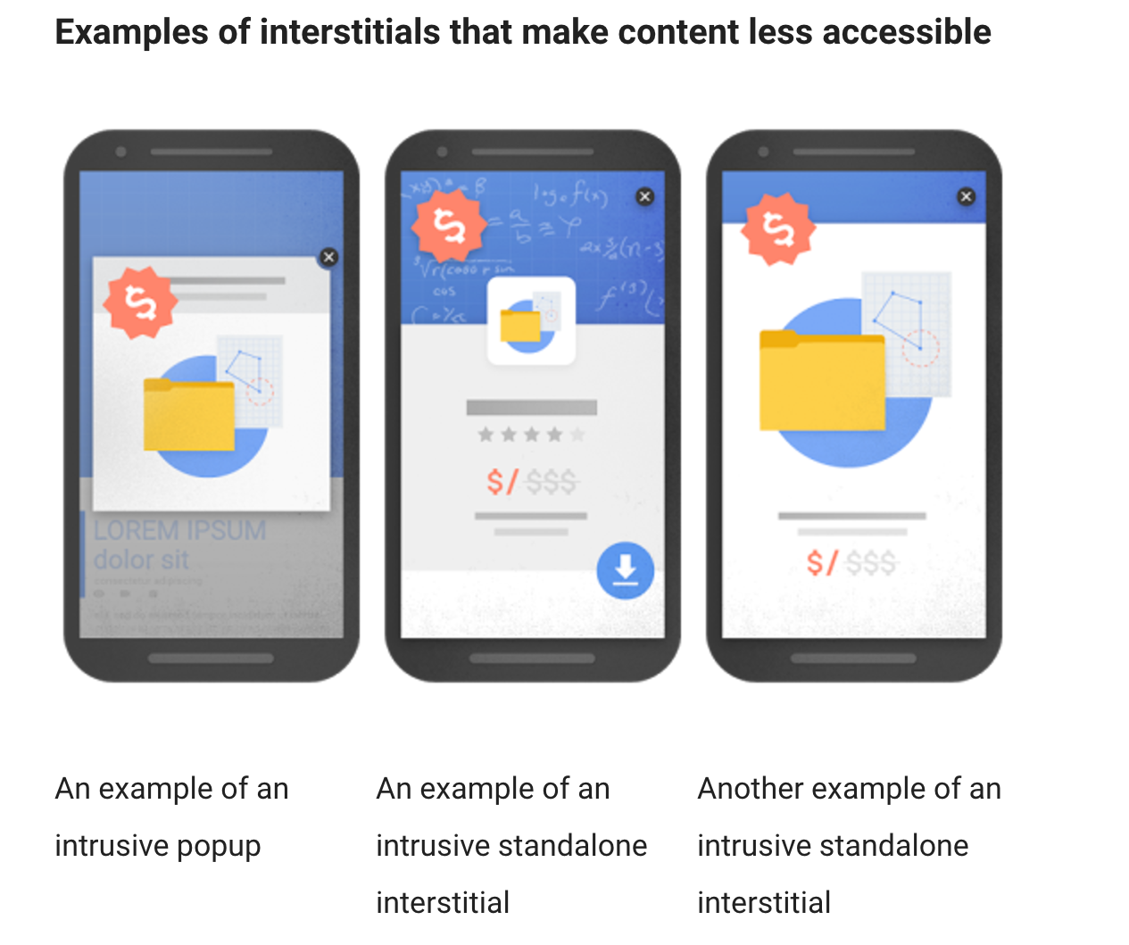
The general rule of thumb is that any intertitial used in mobile sites should NOT be making content less accessible. Examples of such intertitials are shown bellow (source)
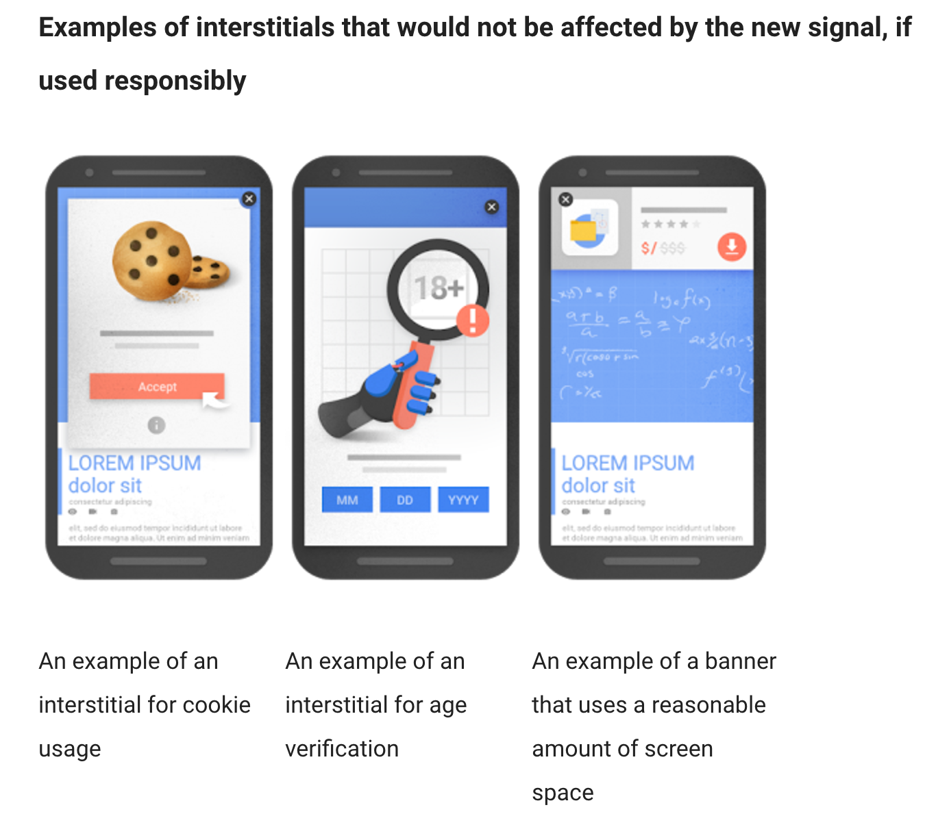
 These types of pop ups, do annoy users and do get penalized by Google, when displayed in mobile. However, not all pop ups and intertitials are bad. There are certain types of interstitial that Google will not penalize, and these can be seen in the following image (source):

These interstitials are legitimate as they do have a reason to be displayed and this is why they are treated differently from Google. In general, the types of interstitials that Google is ok with are the following:
- Pop ups and banners that take a “reasonable amount” of the screen
- Windows that are used to inform users on cookies or other legal issues
- Login screens or payment process pop ups
- Windows that appear when someone clicks on a link or button
Are e-satisfaction questionnaires ok with this?
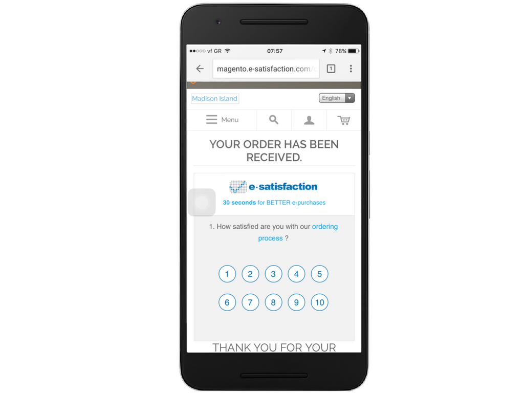
The good thing about e-satisfaction is that the primary way to integrate checkout questionnaires is to embed it in the content, so in the checkout phase, there is no problem with Google.

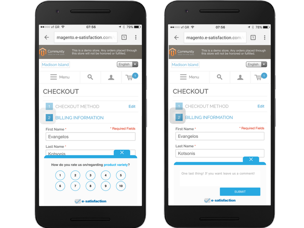
However, in browse questionnaires we did have an issue. The way that e-satisfaction is displayed can be seen in the following snapshot.

The issue in this case is that Google might consider the amount covered in this screen is not “reasonable”, so we proceeded with the following two improvements that are already available for you to use:
- You can determine when to present a browse question to the visitors of your site, thus making this pop up appear on specific users and under specific conditions. You can learn more about how to set this up.
- You can set up the question to be initially minimized and let users determine if they would like to provide feedback.
Conclusion
If we had to make one recommendation is to use only intertitials that do play an integral role in your strategy and we believe that e-satisfaction is an integral part of a human oriented strategy, so we are optimizing it for you. Do not overuse, do not over-push and always respect the customer journey of your customers. The overuse issue for Google is quite new but we will still have to wait and see what the future holds, so take some time now to make you site more and more friendly to mobile users and have all the above in mind.
If you want to discuss more about this issue or learn more about e-satisfaction, we would love to arrange a call with a member of our team.
Also published on Medium.